Guest WiFi Splash Page Design: Best Practices That Convert
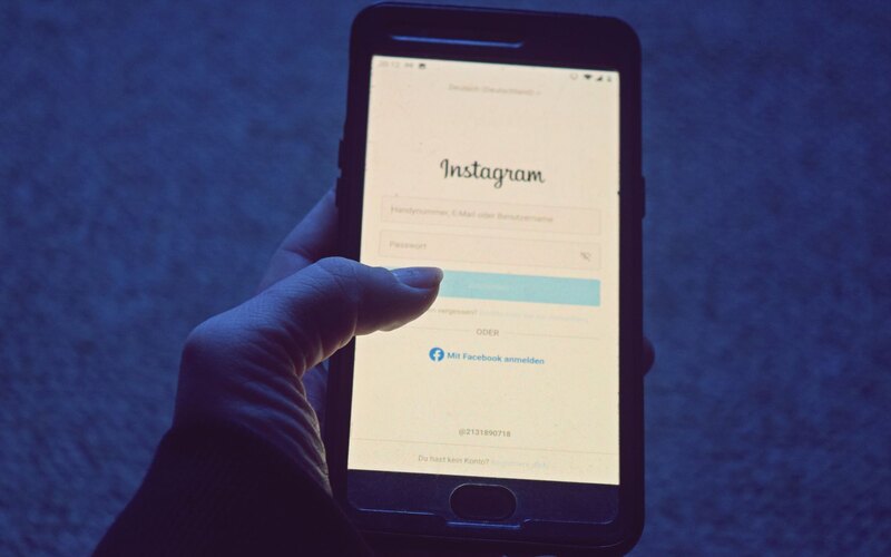
Picture the moment that decides everything. Someone sits down in your pub with a pint, taps your WiFi network, and a page loads on their phone. They have maybe four seconds and one thumb. What they see in that window is the entire difference between a captured subscriber and a guest who connects, forgets you, and leaves.
That page is your splash page, the screen a captive portal shows before it lets a guest online. Most of them are terrible. They ask for a name, an email, a phone number and a postcode, bury the WiFi button below a wall of legal text, and load a giant background photo that takes six seconds over a busy 4G connection. Then owners wonder why nobody signs up.
It does not have to be this way. Venues using CaptiFi typically capture 40 to 60% of connecting guests as email subscribers, which works out at 300 to 500+ emails per location every month. The design choices below are what separate a portal that converts at that rate from one that converts at 10%. None of them are complicated. Most of them are about taking things away.
Start with one clear value exchange
A guest hands you their email in exchange for something. If that something is vague, they will not bother. The single most common mistake is treating the splash page as a form when it is really an offer.
The cleanest exchange is the WiFi itself: free internet in return for an email. That alone converts well because the guest already wants the thing on the other side of the button. You can sharpen it with a second hook that suits the venue: 10% off the next visit, a free coffee on a birthday, first dibs on event tickets. One reason, stated plainly, above the fold. Not three.
The page should answer one question in the guest's head: "What do I get, and what do I have to do to get it?" If a guest has to read twice, you have already lost a chunk of them.
Resist the urge to list every benefit of your loyalty programme. The job of the splash page is to get the connection and the opt-in. The selling happens later, in your welcome email sequence, when you have their attention and more than four seconds of it.
Make it look like your venue, not a vendor
Guests trust a page that looks like the place they are sitting in. A splash page carrying your logo, your colours and a photo of your room feels like part of the experience. A generic grey login box with a stranger's brand on it feels like a phishing attempt, and people treat it that way.
This is not vanity. Branding does real work on conversion because it removes the "is this safe?" hesitation. With branded splash pages you control the logo, background, colours and copy, and the result reads as an extension of the venue rather than a tollbooth. For a chain or group, keep the layout consistent across sites and let each location swap its own photo and offer through multi-venue management.
One detail people miss: match the splash page to the room's actual mood. A wine bar and a gym should not share the same template. The brief here is recognition, not decoration.
Ask for one field: email
Every field you add costs you sign-ups. This is the hill worth dying on. Ask for an email address and nothing else on the first screen.
You might think a phone number or a name would be useful. It would. It is not worth the drop-off. The relationship between fields and abandonment is brutal on mobile, where typing anything is a chore. The same friction shows up in the QR-code world: one vendor analysis from TextingOnly estimates that roughly 70% of people abandon a mobile form before completing it, which is why a QR campaign that earns 1,000 scans can yield fewer than 150 usable leads. A WiFi portal sidesteps most of that because the guest is already motivated to connect, but only if you do not pile on fields.
You can collect a birthday or a name later, once someone is on your list and engaged, by asking in an email. Capture the email first. Everything else is optional and earns its place after the relationship exists, not before. More on the mechanics in our guide to capturing emails from guest WiFi.
Unbundle marketing consent from access
Here is where good design and UK law point in the same direction. Under UK GDPR and PECR, you cannot make access to your WiFi conditional on a guest agreeing to receive marketing. Consent has to be freely given, specific and separate. In plain terms: the guest must be able to get online without ticking the marketing box.
So the page needs two distinct things. One is the action that grants access (a "Connect" button, possibly with a click-through agreement to terms). The other is an optional, unticked checkbox: "Send me offers and news by email." Pre-ticked boxes are not valid consent, and bundling marketing into the access requirement is the single most common compliance failure we see on portals built without it in mind.
The counter-intuitive part: unbundling consent usually raises the quality of your list and often the size of it too. People tick a box they understand and trust. CaptiFi handles this split by default with UK GDPR and PECR compliant consent, so the WiFi works regardless and the marketing opt-in stands on its own.
For the full picture, run through our guest WiFi GDPR compliance checklist before you go live.
Design for the phone in someone's hand
Near enough every guest hits your splash page on a phone, often a slightly old one, frequently in a pop-up captive-portal browser that is more limited than a full Safari or Chrome. Design for that and nothing else.
The button has to be large and tappable without zooming. Text has to be readable at a glance. The email field should trigger the email keyboard, not the default one. Keep the whole thing to a single screen so there is no scrolling to find the button. If a guest has to pinch, zoom or hunt, you have lost them, and they will not complain. They will just give up and use their data.
- One screen, no scroll. Offer, field, consent tick, button, all visible at once.
- Thumb-sized button. Big, central, obviously the next step.
- Minimal text. A headline, a line of value, the field. Legal links can sit below.
- Test in the real captive browser. What looks fine in Chrome can break in the cut-down portal view.
Social proof and load speed
Two quieter factors move the needle more than people expect: a little trust signal, and raw speed.
A small piece of social proof reassures a hesitant guest. A line like "Join 4,000 regulars" or a visible star rating tells them other people did this and nothing bad happened. Keep it honest and keep it tiny. It is a nudge, not a billboard.
Speed is the brutal one. Google's mobile research, widely cited via SOASTA, found that roughly 53% of mobile visitors abandon a page that takes longer than three seconds to load. Your splash page often loads over the same congested connection the guest is trying to join, so a heavy background image or a stack of web fonts can push you past that threshold before the page even appears. Compress images hard, lean on system fonts, and keep the page light. A fast plain page beats a beautiful slow one every single time.
| Element | Conversion job | Get it wrong and... |
|---|---|---|
| Value exchange | Gives a reason to opt in | Guests connect but never subscribe |
| Branding | Builds trust and recognition | Page feels like a scam, sign-ups drop |
| Single email field | Cuts typing friction | Each extra field shaves the opt-in rate |
| Unbundled consent | Keeps you legal, lifts list quality | PECR breach and an untrustworthy list |
| Mobile layout | Lets a thumb finish in seconds | Scrolling and zooming kill completion |
| Load speed | Shows the page before they quit | ~53% gone past three seconds |
The do and do-not list
Pin this near the person who builds your portal.
Do
- Lead with one clear offer above the fold.
- Use your own logo, colours and a photo of the venue.
- Ask for email only on the first screen.
- Keep the marketing opt-in as a separate, unticked box.
- Make the connect button big enough to tap one-handed.
- Compress everything and test the page on a real phone.
- Add one small, honest trust signal.
Do not
- Do not require marketing consent to get online. It is unlawful and it backfires.
- Do not pre-tick the consent box.
- Do not ask for name, phone, postcode and date of birth up front.
- Do not bury the WiFi button under terms and conditions.
- Do not load a 2MB hero image over a captive-portal connection.
- Do not use a generic vendor-branded template that ignores your venue.
- Do not make the guest scroll to find the next step.
What quietly kills conversion
The obvious mistakes are easy to spot. The quiet ones are what hold most venues at a 10 to 20% opt-in rate when they could be at 40 to 60%.
The first killer is asking too much, which we have covered. The second is a slow or broken page in the captive browser, which you only catch by testing on an actual phone rather than your laptop. The third is a mismatch between the offer and the venue, where a generic "subscribe for updates" line replaces a concrete reason. The fourth, and the one that compounds, is having no follow-through: you capture the email and then never send anything, so the list rots and the value vanishes.
That last point matters because the splash page is the start of a chain, not the end. A captured email is worth something only when it feeds automated welcome, win-back and birthday emails and ties into Google review automation. Done well, venues commonly see a meaningful lift in Google reviews and in repeat visits from win-back campaigns, though these are typical results rather than guarantees. The portal opens the door. The follow-up is what pays for it. There is a wider view of the whole system in our WiFi marketing complete guide for 2026.
If you want to skip the trial and error, CaptiFi is a guest-WiFi marketing platform that layers a branded splash builder, compliant consent and the email and review automation on top of your existing network. It works with UniFi, TP-Link Omada, Cisco Meraki, Aruba, MikroTik, Ruckus, Cambium and DrayTek hardware, plus a free plug-and-play device, so you do not need to replace anything. You can start a 30-day free trial with no card and test the design ideas above on your own guests.
Sources: Google Business Profile Help; Google/SOASTA mobile load research; TextingOnly QR-funnel analysis; UK GDPR and PECR guidance. Third-party figures attributed inline. CaptiFi capture figures are typical results, not guarantees. Correct at the time of writing, June 2026.
Frequently asked questions
Quick answers to the most common questions about this topic.
How many fields should a WiFi splash page have?
Can I require guests to accept marketing to use my free WiFi?
What opt-in rate should a good splash page achieve?
Why does my splash page load slowly for guests?
Should I put my logo and branding on the splash page?
What is the single biggest mistake on WiFi splash pages?
Does adding social proof to a splash page help?
What happens after a guest opts in on the splash page?
Do I need new hardware to use a branded splash page?
The CaptiFi Editorial Team writes about guest WiFi marketing, captive portals, GDPR-compliant data capture, and local SEO for venue operators. We base our recommendations on real customer outcomes and verified third-party reviews from G2.com.
Ready to turn your guest WiFi into a marketing engine?
CaptiFi captures customer data from every WiFi login, automates Google reviews and email follow-ups, and plugs into the tools you already use. Free hardware, transparent pricing, 30-day free trial.